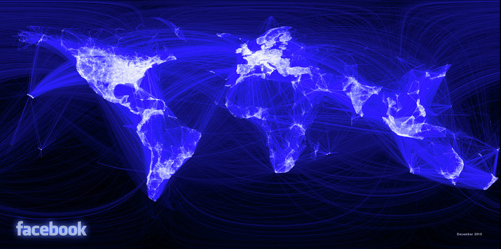
Sometimes it's hard to wrap your mind around 500 million people, all accessing a single website. These people all interacting through buried cables and invisible channels in the air; luckily Paul Butler, an intern at Facebook's data infrastructure engineering team, thought he would help us imagine these paths. Using the interactions of Facebook users he's managed to plot shapes that, for the most part, outline the continents of the world. This image is just beautiful and really shows us just how influential this site has become.
Paul Butler was quoted, looking at this image, to say :
""What really struck me, though, was knowing that the lines didn’t represent coasts or rivers or political borders, but real human relationships."


 RSS Feed